The Gestalt Principles are a set of foundational rules in visual perception and design that describe how humans naturally organize visual elements. Among these principles, the Principle of Proximity is often considered the first and most intuitive. This principle emphasizes that elements that are close to one another tend to be perceived as a group, rather than as individual, unrelated objects. Understanding this principle is essential for designers, marketers, educators, and anyone involved in visual communication.
In this article, we will explore the Principle of Proximity in detail, its significance in design, practical applications in digital and physical media, common mistakes, and tips to effectively leverage this principle for optimal communication.
Introduction to Gestalt Principles
Gestalt Principles originated from Gestalt psychology, a school of thought founded in the early 20th century by German psychologists like Max Wertheimer, Wolfgang Köhler, and Kurt Koffka. The central idea is that the human brain prefers to perceive whole forms rather than a collection of individual components. In other words, our minds naturally organize chaos into meaningful patterns.
These principles are vital in areas like:
- Graphic and web design
- UI/UX design
- Marketing and advertising
- Educational content creation
- Architecture and interior design
Among the Gestalt Principles, the Principle of Proximity is foundational because it directly affects how viewers perceive relationships between elements in a visual space.
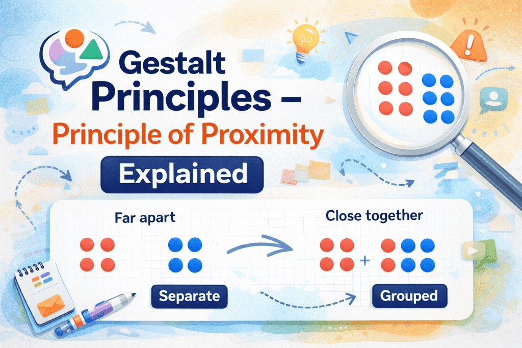
The Principle of Proximity Explained
The Principle of Proximity states:
“Objects that are close to one another are perceived as a group.”
This principle relies on the natural tendency of the human brain to organize visual information efficiently. When elements are physically close, the brain assumes they are related, even if there is no explicit connection.
Example:
- If you see a list of words grouped closely together, your brain interprets them as related categories.
- In a website menu, items that are spaced apart may feel unrelated, while items placed near each other form a coherent navigation group.
Proximity isn’t just about spatial closeness. It can also refer to temporal or conceptual proximity—for instance, when two events occur close together in time or two ideas are presented sequentially, people tend to link them mentally.
Psychological Basis of Proximity
The human brain constantly looks for patterns and relationships. This behavior is rooted in evolutionary psychology, where identifying groups in a visual field was essential for survival. For example:
- Recognizing clusters of prey or predators
- Identifying social groups
- Understanding cause-and-effect relationships
In modern times, this manifests in design and communication. When objects are grouped, viewers instinctively see them as related. Conversely, elements spaced farther apart appear distinct.
Cognitive scientists suggest that proximity reduces cognitive load, allowing users to process information faster. By grouping related items, designers help viewers understand meaning at a glance, improving comprehension and usability.
Proximity in Real-World Design Examples
- Print Design
In print media like magazines, brochures, or posters, the Principle of Proximity is used to guide the reader’s eye:
- Headlines are placed close to subheadings.
- Captions are aligned near images.
- Related articles or sections are grouped to indicate a logical flow.
Example: A magazine may place the article title, author name, and publication date in close proximity, signaling they belong together.
- Web Design
Websites use proximity to improve navigation and readability:
- Navigation links grouped together are interpreted as a menu.
- Related product items placed close together are seen as part of a collection.
- Forms with related fields grouped reduce user confusion.
Example: On an e-commerce site, product name, image, and price are placed near each other, making it easier for the user to understand the product information.
- Advertising
In advertising, proximity reinforces brand messaging:
- Product images are placed close to their description.
- CTA (Call to Action) buttons are positioned near the offer or product information.
This spatial arrangement guides attention and creates a visual hierarchy, influencing user behavior.
Applying Proximity in UI/UX Design
Proximity is a core principle in user interface (UI) and user experience (UX) design. It helps create intuitive and easy-to-navigate interfaces.
- Grouping Related Functions
Buttons, icons, or menu items with similar functionality should be grouped. This helps users identify relationships and reduces the cognitive effort required to complete tasks.
Example: In a photo editing app, all image adjustment tools like brightness, contrast, and saturation are grouped together.
- Information Hierarchy
Proximity helps create visual hierarchy, guiding users’ eyes to the most important elements:
- Headlines placed above related text blocks
- Highlighted buttons near key messages
- Forms with related fields grouped to reduce confusion
- Enhancing Readability
Text blocks with proper spacing improve readability:
- Paragraphs should have consistent spacing
- Headings should be distinct but near related content
- Bullet points grouped properly indicate a cohesive set of information
Proximity in Web and Mobile Interfaces
- Responsive Design
In responsive design, the proximity principle ensures that elements maintain logical grouping across devices:
- Mobile menus often collapse but maintain grouping.
- Related content sections remain close even in narrower layouts.
- Buttons and Calls-to-Action
Calls-to-action should be placed near relevant content:
- “Buy Now” buttons close to product details
- “Sign Up” buttons near subscription benefits
- “Learn More” links near feature descriptions
This spatial closeness improves conversion rates because users understand the connection without extra thought.
- Cards and Grids
Cards or grid systems leverage proximity:
- Each card groups image, title, and description
- Related cards placed near each other signal category
- White space between unrelated groups reinforces separation
Proximity in Print Design and Marketing Materials
In print design, proximity is crucial for clarity and emphasis:
- Brochures: Service descriptions are grouped with icons.
- Flyers: Contact information is close to the call-to-action.
- Packaging: Ingredients, usage instructions, and warnings are grouped logically.
Marketing Tip: Proximity can subtly influence perception. For example, placing a price near the product image creates a mental association, affecting purchase decisions.
Proximity in Educational Materials
Educators can leverage proximity to enhance comprehension:
- Group related concepts in diagrams and charts
- Keep instructions close to corresponding questions or examples
- Use spacing to differentiate main points from supporting details
Example: In a math textbook, the problem statement is close to the example solution, so students can associate the instruction with the method.
Common Mistakes to Avoid
Even experienced designers sometimes misuse the principle of proximity. Common mistakes include:
- Overcrowding: Placing too many elements close together creates confusion rather than clarity.
- Inconsistent spacing: Irregular spacing can mislead users into thinking unrelated items are grouped.
- Ignoring hierarchy: Proximity alone isn’t enough; it should complement size, color, and alignment.
- Neglecting white space: Proper use of negative space is essential to define groups clearly.
- Not considering mobile layouts: Elements may appear grouped on desktop but misaligned on mobile, confusing users.
Tips to Apply Proximity Effectively
- Group related items: Ensure visually and conceptually related elements are close together.
- Separate unrelated items: Use adequate spacing to distinguish distinct groups.
- Combine with other Gestalt principles: Proximity works best with similarity, continuity, and closure.
- Test across devices: Ensure grouping remains logical on all screen sizes.
- Use white space wisely: Negative space enhances grouping perception.
Pro Tip: Designers often use grids and alignment tools to maintain consistent proximity across interfaces.
Conclusion
The Principle of Proximity is the cornerstone of effective visual communication. By grouping related elements and separating unrelated ones, designers and communicators can guide attention, reduce cognitive load, and enhance comprehension. From UI/UX design to print media, advertising, and education, proximity shapes how audiences interpret information.
Mastering proximity, along with other Gestalt principles, allows creators to design intuitive, engaging, and visually coherent experiences. Neglecting it, however, can lead to confusion, inefficiency, and missed opportunities in communication.
FAQs
Q1: What is the Principle of Proximity in simple terms?
A1: It means that things placed close together are seen as a group or related.
Q2: How is proximity used in web design?
A2: It’s used to group buttons, menus, or content blocks so users understand relationships without extra thought.
Q3: Can proximity affect user behavior?
A3: Yes. Placing a CTA near relevant content increases the likelihood of user interaction.
Q4: What is the difference between proximity and similarity?
A4: Proximity relates to physical closeness, while similarity relates to visual features like color or shape.
Q5: Why is white space important for proximity?
A5: White space separates unrelated elements, making groups more distinct and content easier to understand.
